Melomane
Say It Through Song
Problem Statement
Music lovers need a way to share music with friends that is convenient to lessen the hassle of sharing via other platforms.
Role
UX Researcher & Designer
Timeline
Sept 2019 - April 2020
Audience
Music enthusiasts and people who enjoy sharing music with others
Overview
Upon conversation with one of my fellow Creators in Shift (a creative incubator for students at UMich), we realized that we were passionate about exploring how friends share music via Spotify. As avid Spotify users, we began discussing our experience with the platform - the things we loved, and the things we weren't so keen on. One thing that frustrated us both was sharing music with friends. Many of my friends will send me their current obsessions over iMessage, only to get buried under a pile of more texts. It becomes hard to keep track of what my friends want to share with me or even what their current listening habits are, especially on the app. My partner-in-crime, Olduz Ilkhchoui, and I set out to see whether this feeling of frustration was shared by any other Spotify users.
How might we generate quality music discovery in an organized fashion?
Step 1: Empathize & Research
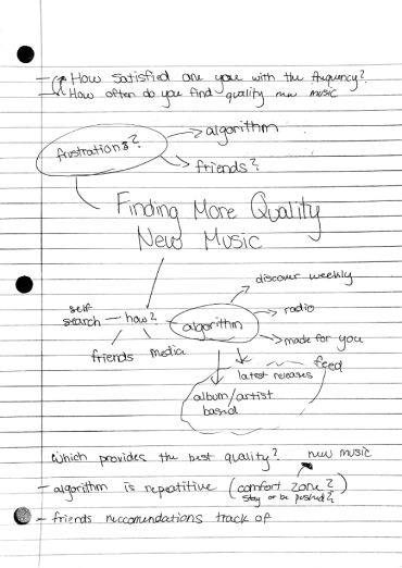
We began our journey by sending out a basic survey to gain insight into how Spotify users engage with each other in the app and outside the app. We needed to see if there is a need to expand the friend feature of Spotify, before sinking our toes into creating an actual product. In order to solve a problem, you first have to know the ins and outs of the problem. Enter, Survey #1.
Designing the Survey
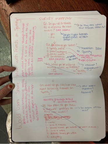
The main question we wanted to address was how friends play a role in music discovery. To ensure that our survey was not biased or influenced by the behavior of our respondents, we piloted the first versions to beta-test our questions. In addition, we made the survey anonymous to encourage users to give their honest opinions. We also mixed in short answer questions and multiple choice questions to get both quantitative and qualitative data.
Quantitative Data
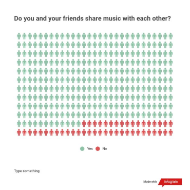
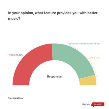
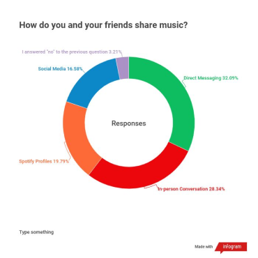
After sending out our survey to as many people as possible, we received a great deal of data. Here are some of our key findings from the questions that gave us quantitative data:
Qualitative Data
After filling out a couple hundred sticky notes, I found several key qualitative findings by grouping the responses by theme.
Q1: What role does Spotify play in you staying up to date on the music your friends are listening to?
- Using the friend feed on the desktop app
- SMS or other messaging platforms to share music
- Sharing via social media platforms
- No role
Q2: Can you please explain why you think Friends or Spotify Recommendations provides better music than the other?
- Those who found Spotify recs to be better:
- tons of data on your listening habits
- algorithms
- don't have similar music tastes as their friends
- Those who found friend recs to be better:
- community
- personal connections to songs
- feels more personalized
- friends know you better than any algorithm could
Q3: How do you feel about following friends on Spotify?
- Hate: the feature doesn't feel fleshed out so it seems pointless; do not like it because music is private
- Love: they want to see what their friends listen to
Q4: Why do you follow friends on Spotify?
- To listen to their playlists
- Find new music
User Personas
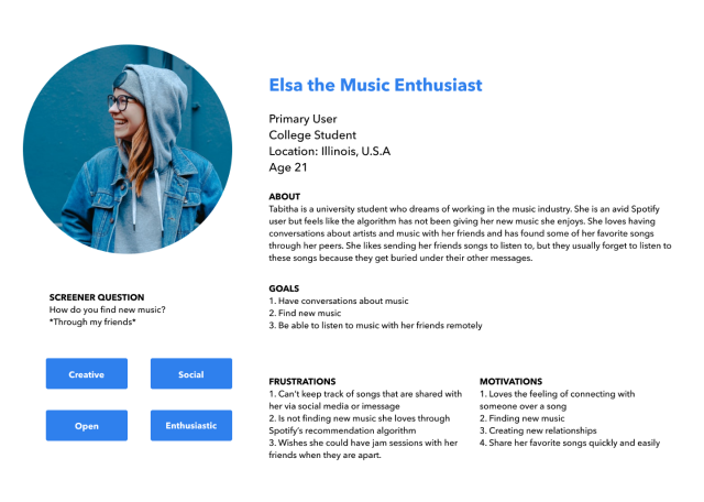
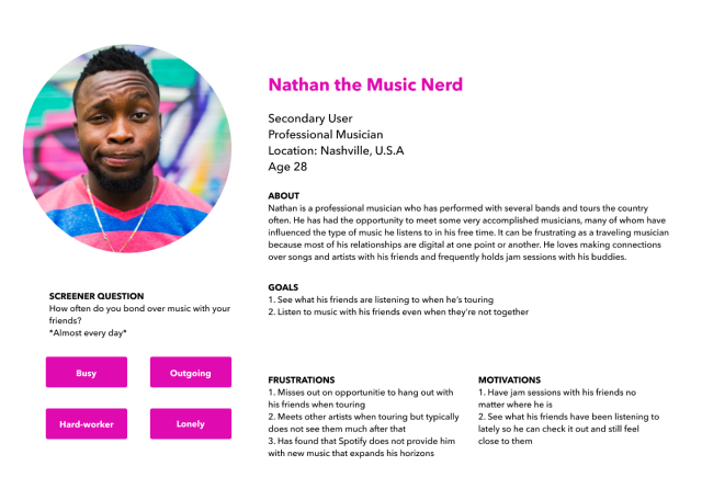
Based off of the data I gathered, I began to fabricate user personas to understand the different types of people that may use my product:
Step 2: Conceptualize
Information Architecture
Based off of these results, we felt there was a need to expand on this idea of sharing music with friends. Instead of building out this feature on Spotify, we decided to make our own platform, Melomane, that would utilize Spotify's API to get music data. With this app, those that wanted to opt into sharing music can post about songs, artists, or playlists and get recommendations from friends. They can also see what their friends listen to in real time. Using the results from our research, we created a layout of what sorts of screens and actions our app will need.
Sketching
After finalizing the information architecture, I felt more prepared to start imagining what my screens might look like. I began by doing some quick sketches:
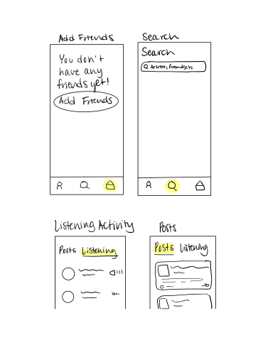
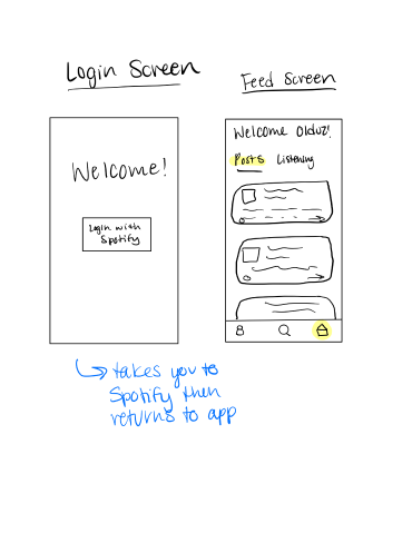
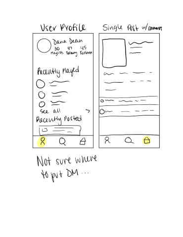
Step 3: Prototype
Lofi Prototype
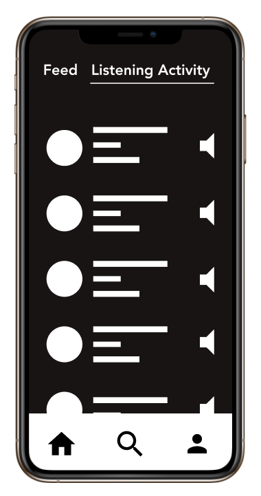
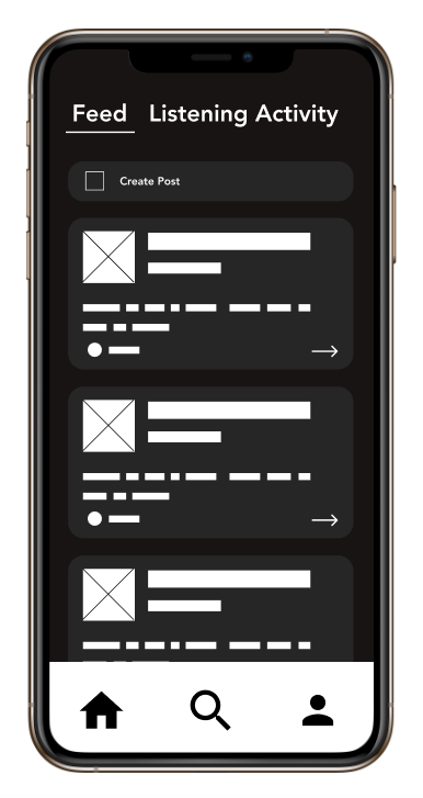
Once I felt good about my initial sketches, I began to build them out as more sophisticated screens. I focused more on what content would go where, the overall flow, and the information hierarchy. I decided to keep it black and white and did not add many visual details, so that I could really hone in on making the navigation clear and user friendly.
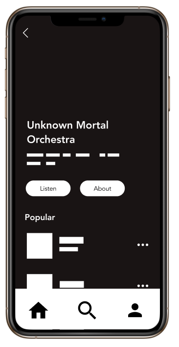

Internal Feedback
After completing my lo-fi screens, I went out and received feedback on my initial designs. My main critiques were:
- Think of the value I can provide that Spotify isn't providing; how can I create new value
- Give Feed and Listening Activity their own tabs in the main menu because they are the key features of the app
- Think about how you can make an app that feels like Spotify but has it's own unique UI
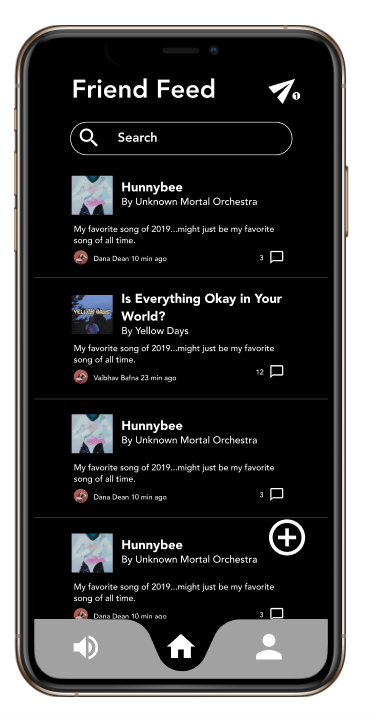
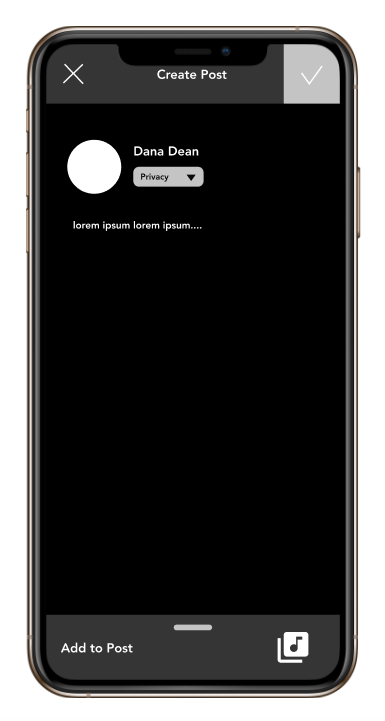
Mid-Fidelity Prototype
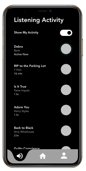
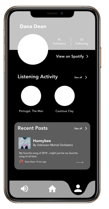
This first round of feedback was crucial. It allowed me to really think about the value of creating a whole app, and how I can reveal that value to users. I took this knowledge and drafted mid-fidelity mockups, still focusing on the overall layout and navigation, and not as much on the colors or visual design.
High-Fidelity Prototype
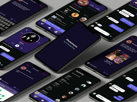
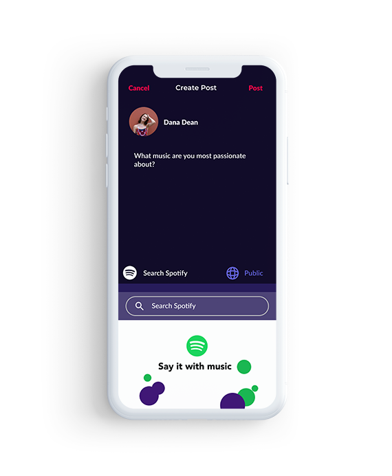
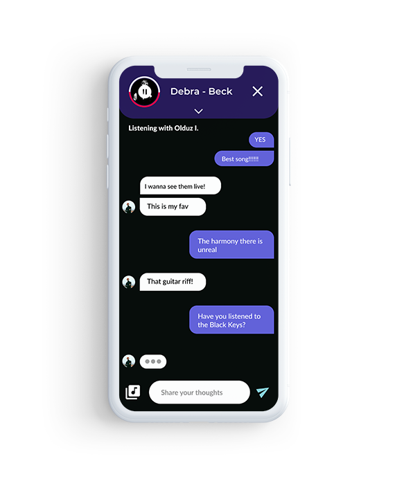
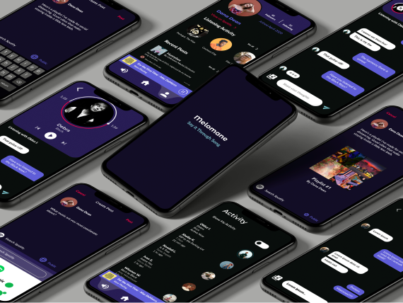
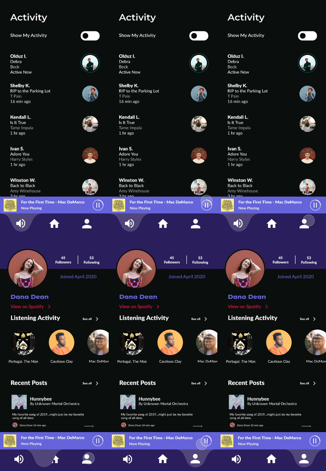
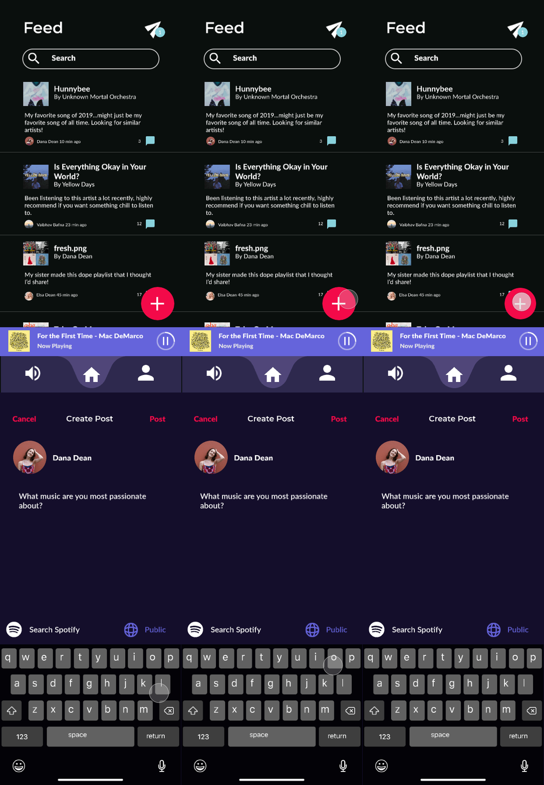
Feeling good about my layout, I began to incorporate color and font into my designs.
Design Choices
- Colors
- Purple: combines the calm stability of blue and the ferocity of red; represents magic and creativity which I associate with music
- Secondary bright red: for some contrast, making the design more accessible
- The overall combination of colors plus the mostly black interface are meant to reflect concert lighting and atmosphere
- Font
- Montserrat Alternates: the Melomane logo
- Montserrat: for headers
- Lato: for the remaining text; combines well with Monserrat for easy-to-read, modern typography
- Rationale of my solution
- Having two out of the three menu items dedicated to the main tasks a user can do makes the process easy and fast
- Allows users to see what their friends are listening to and post about music - both of which are avenues of music discovery and can create conversations
- The onboarding process is very simple, for users only have to allow access to Spotify, which keeps them engaged so they will be more likely to use the product
- The format of the post feed was based off of Twitter. Twitter has a very clean and simple format that uses indentation to tell users who created the post and who has commented on it
- I did not include likes or reposts because I did not want to create something that turned music into social media. I wanted to create conversations around music, not create another platform for people to crave likes or other popularity metrics
Next Steps
I plan to conduct user tests to make sure that it is user friendly. Once I am confident that it is easy to use, I will re-work the navigation and UI based on these results. I am a bit of a perfectionist, and will most likely continue to edit my high fidelity screens until I am absolutely satisfied with what I have. I plan to learn more about micro-animations before including videos of the app in action. For now, I wanted to show what I have currently, so that interested parties can see my process.
