
Cookie Jar
Reimagining Memory Sharing Beyond Likes & Algorithms
Bringing design thinking and a user-centric mentality to an early stage startup
Timeline
May - August 2020
January 2021 - October 2021
Role
UX Research
Interaction Design/Strategy
Team
Hanzi Brunk: CEO & Designer
Lis Kanzler: CMO & Researcher
Me: UX Design Lead
Jon Schroder: CFO
Developers varied

The Social Media Dilemma
The pursuit of ‘likes’ is over. Millenials are searching for real relationships and private communities online.

How might we create a private and safe place for sharing meaningful memories in a collaborative way?


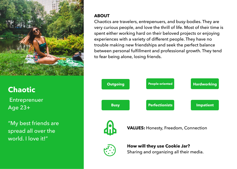
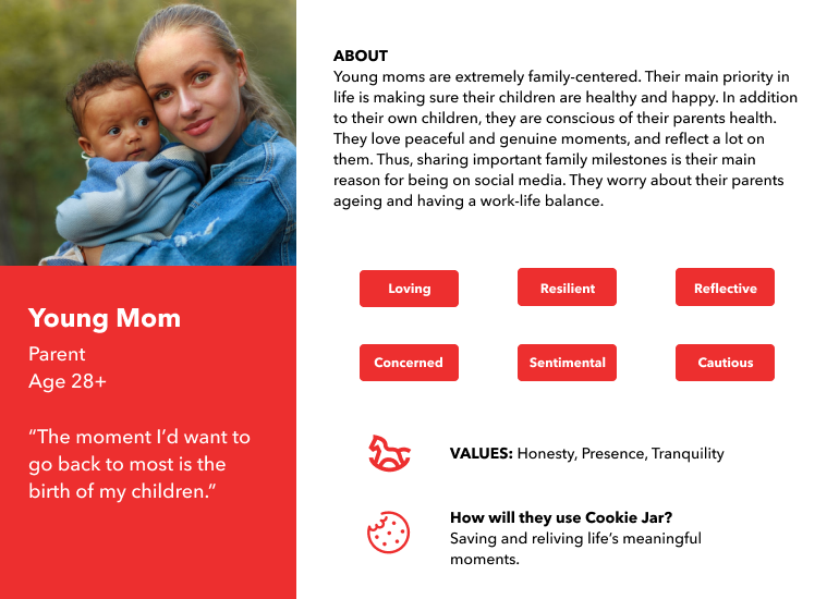
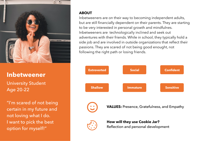
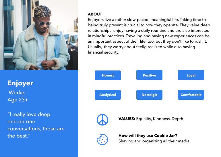
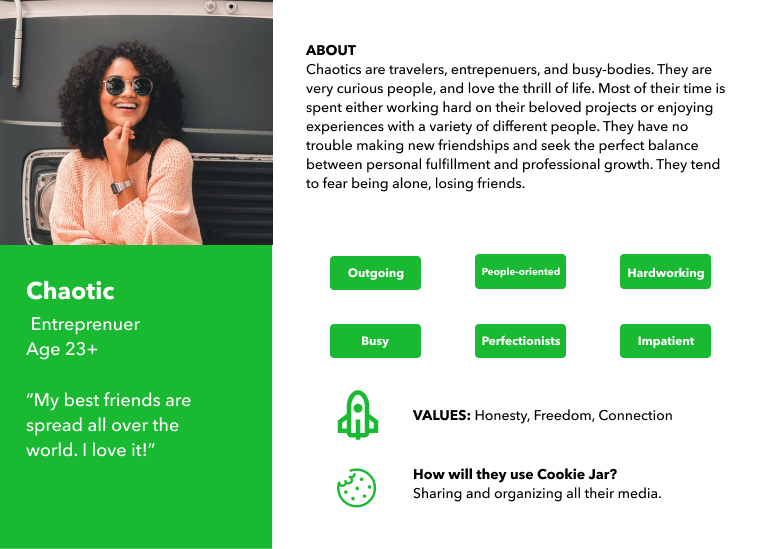
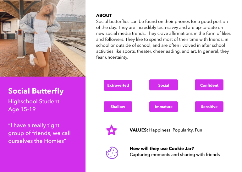
Who is most affected by the downsides of Social Media and most likely to search for an alternative?
I lead our discovery phase with CMO, Lis Kanzler. After developing a script, we conducted 20 interviews, resulting in the discovery of 2 primary users and 4 secondary users.
What is the value of solving the social media dilemma?
To answer this question, I conducted another round of user interviews with the CMO. We found 4 key pain points.
Turning Pain Points Into Design Opportunities

Usability Testing
With these initial designs already created, I chose to be agile and led usability testing with the CMO. We had 3 main findings.
- Lots of confusion regarding the purpose of the Plus button
- A walkthrough is necessary as the app is complex
- App looked like any other social media app, very plain
Ideating
Based on the feedback from testing I set about creating a more unique interface, an easier way to distinguish creating Cookies vs Jars, and a basic walkthrough.
Inspiration for Unique UI - Neumorphism
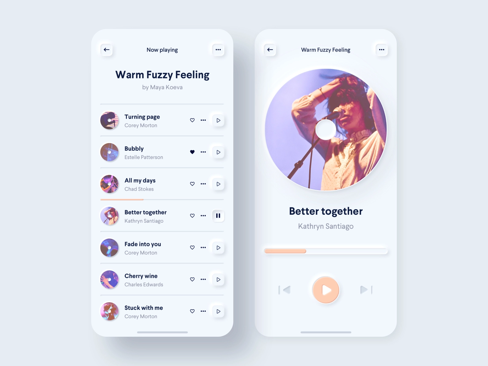


Re-Designing the Bottom Nav
Goal: remove secondary actions from the navbar and help distinguish between creating Cookies and Jars.
Sketches


Wireframes


Beta Testing


Creating Our First Beta Testing Script and Plan
At this point in time our team was able to create 12 groups or “bubbles” as we liked to refer to them, with between 3-8 testers. There were 62 total testers, ages 14-35.

Research Questions
We wanted to answer the following questions with this round of testing:
- Can users understand the difference between a Cookie and a Jar?
- How/when did our users utilize the app?
- Did the changing “create” button help users understand how to create Jars and Cookies?
- Did the overall layout create a seamless experience?
Usability Testing
In order to standardize testing I developed scripts and all testers were given the same onboarding. Testing was split into 3 sessions as shown below:

Research Debrief
Each member of the team documented their findings in a Master feedback sheet at the end of every week using a rating system scored from 1 (dealbreaker, big problem) to 5 (hardly mentioned, barely impedes usbaility). Here is a sample:

Main User Challenges
- As a user, I cannot figure out what switching between the Jar and Cookie tabs means/what the value is
- As a user, I do not understand the difference between Jars and Cookies
Expanding on User Challenge #1
“I feel a bit unsettled when I open the app and don’t know where I am. I want the home screen to be the jar screen, not a random cookie”
-Beta Tester

Expanding on User Challenge #2
“The difference between creating cookies and creating jars is not easy to distinguish, especially because the ways to create them are identical.”
-Beta Tester


MORE Expanding on MORE User Challenges!!
There were two other pain points that were worth mentioning.
1. One of the key ideas of Cookie Jar is being able to share/create moments with the others that were present with you. When a user first entered the app, there wasn’t any mention of this, which buried it away.
2. In our onboarding, jars were referred to as playlists to try and help users understand the levels of organization. This added to the confusion between Jars and Cookies. Simply referring to them as an album or collection makes it simpler.
Solution: Changed the verbiage when describing jars and give users the chance to add friends right away in onboarding

Post-Beta Usability Testing
Lis and I tested the new prototype with 6 interviewees total. This wasn’t as in-depth as the Beta Testing. In this round, we simply wanted to see if users could figure out how to complete the same tasks with the new interactions.
Findings
- 2/6 testers did not notice the Home button
- No bottom bar did not impede users from completing tasks
- Users wanted to be able to add a moment to multiple jars
- 2/6 testers thought friend requests was within notifications not a separate button
- Deleting photos from a moment is not intuitive
Next Steps
As we are currently in a stage of development, new design changes are on the backburner. However, we plan to user test a larger Home button, A/B test friend requests being it’s own button or within the notifications button, and ideate on the flow for deleting photos from a moment. We have already implemented adding a moment to multiple jars.
Key Takeaways
- The startup design process is anything but orthodox
- Your favorite visual designs aren’t always the most intuitive
- Wireframing is important and useful in ideating! Even though we didn't have a timeline that allowed for it, it would've saved some changes for dev
Other Cookie Jar Projects I Have Worked On:
- Information architecture
- Collaborated for a redesign of the UI
- Lead iXperience interns
- Design collateral for social media and investors
- Push notifications case study
- Re-branding
- Content strategy