Accenture
Transforming Innovation Workshops into Seamless Client Experiences
Summary
Designing interactive microsites to streamline workshop navigation and enhance client engagement at Accenture’s Innovation Hubs, where industry-specific solutions drive business transformation.
Team
I was typically the only designer and would work with both Account Team members and Innovation Hub members in order to gather content.
Clients
Global Food & Beverage Corporations, International Hospitality Group, Financial Services Firm, etc.

01
Setting the Scene
What is a microsite?
In March 2023, I became a subject matter expert dedicated to designing and developing over 11 unique microsites tailored for various clients. A microsite is an interactive prototype that mimics the functionality of an actual app or website on a mobile device, although it is not coded. Each microsite is either branded with Accenture's identity or aligned with the specific design guidelines of the client, ensuring a seamless and customized user experience.
Client ask
Accenture’s Innovation Hubs host high-level strategy workshops, bringing together industry leaders to solve complex business challenges. To improve the client experience, Accenture needed a streamlined digital solution that would provide participants with workshop details, schedules, and key information in an accessible and engaging format.


The challenge
Workshop logistics were often fragmented, with critical details scattered across emails, PDFs, and slide decks. This lack of a centralized, user-friendly reference point led to confusion and inefficiencies, making it difficult for clients to navigate the workshop experience smoothly. Accenture needed a digital tool that could provide clear, structured information while aligning with the unique branding of each client.


The average timeline
Each microsite site had a different timeline - some as long as a month and some as little as a week. On average, I had two weeks to crank one out.

02
Research & Initial Insights
Building the microsite concept from informal research
Due to the fast-paced nature of the work, I focused on gathering initial insights based on the needs of the client, the workshop team, and past event feedback. Based on this information along with my own personal experiences with clients, I identified key pain points:
1.
2.
3.
Clients were often confused about logistics like venue navigation, security procedures, and Wi-Fi acess. Navigating a new experience can even trigger situational anxiety in some.
Information overload created frustration, and clients were unclear on which parts of the day were most relevant to their needs.
Clients wanted a central location for all event-related materials that could be viewed on their phone, prior to microsites, we emailed out pre-read materials in the form of slide decks.
User persona based on informal research

03
Design Phase
Building my first microsite iteration
I began by drawing some quick wireframes of what a microsite might look like.


But before building some lofi designs in Figma, it was important to acknowledge....
Development as the biggest constraint
These projects were never given the budget to allow for a developer. Because of this, the microsites were always clickable Figma prototypes that the clients were given a link to. This limited some functionalities, but didn't stop me!!

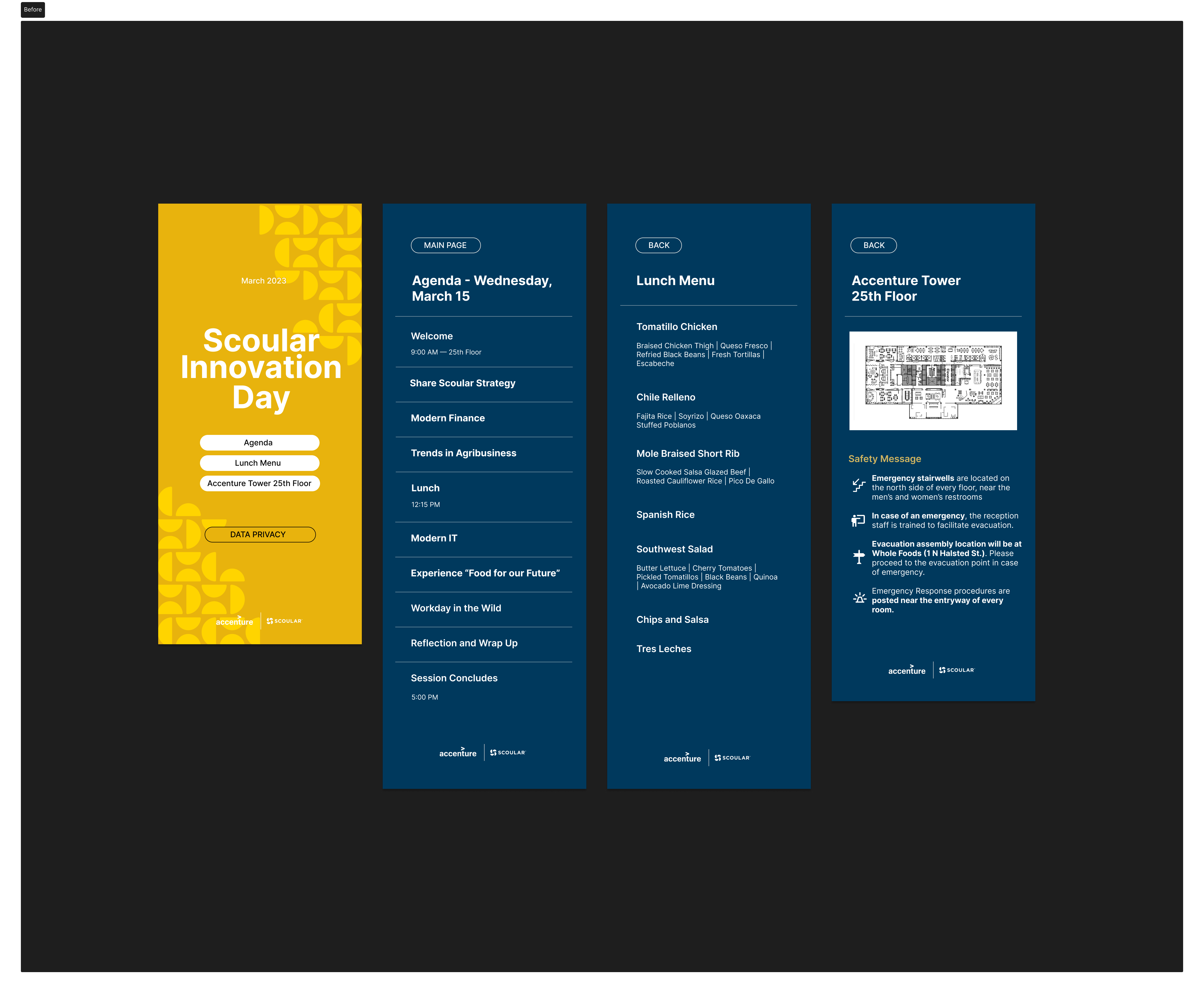
First microsite iteration: Scoular
One of the first microsites I built was for an agribusiness and supply chain company. This first iteration lacked visual hierarchy and did not provide as much detail as my final microsites. I also did not have a design system at this point, nor did it have any animations.


04
Final Designs
The evolution of the microsite
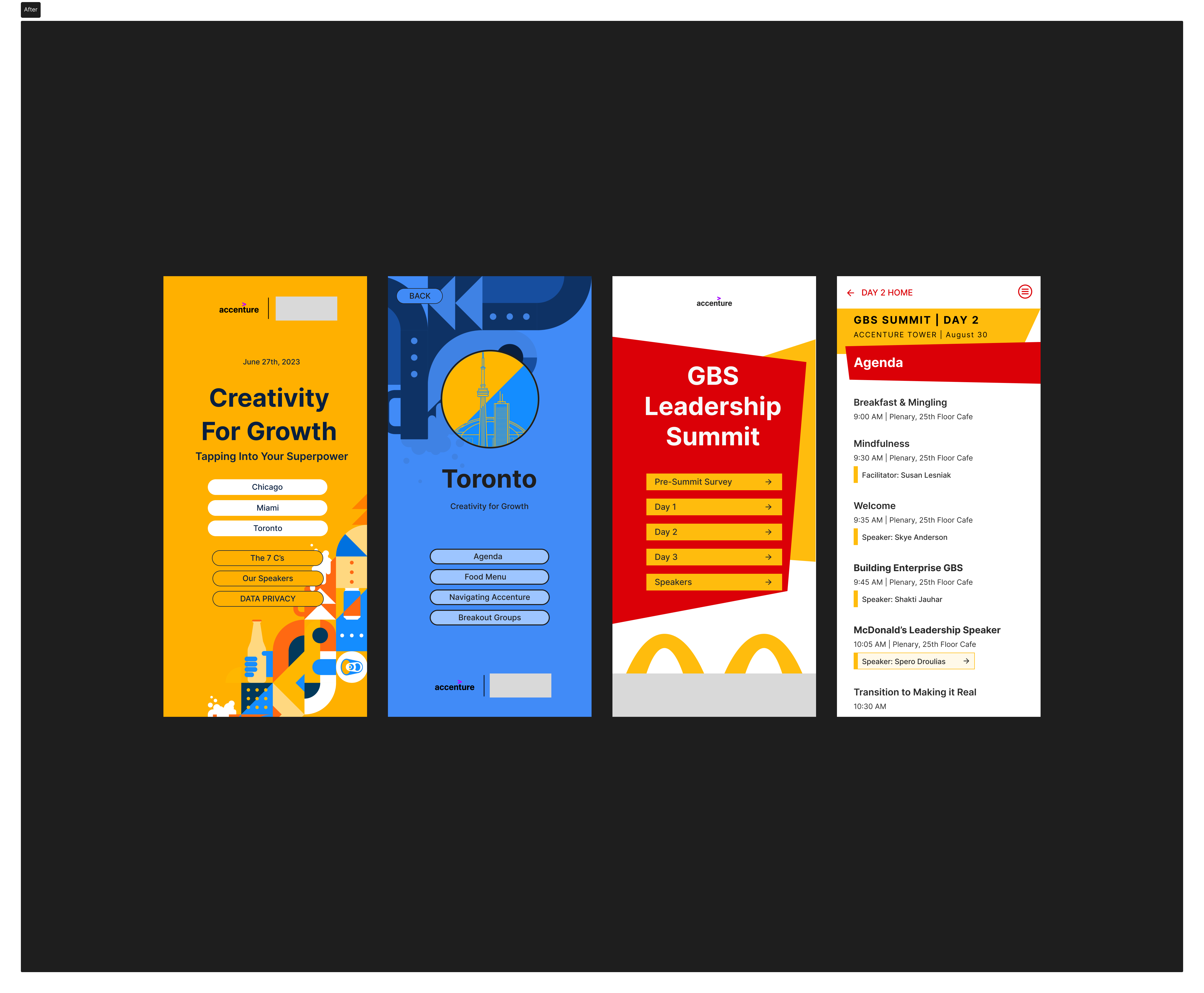
After building the first iteration of the microsite and observing client usage, I met with the Innovation Hub team to discuss improvements. The client didn’t want anything removed, but they requested more detailed information. By microsite #3, the design had evolved with a clearer visual hierarchy and more comprehensive content, making it a more effective tool.
Microsites consisted of...
Each microsite was crafted to serve as a comprehensive resource hub for workshop attendees, containing:
Arrival and office information

Detailed agendas

Menu options

Speaker bios

Overview of demos

Additional relevant info

Building a design system
I developed a design system to streamline the creation of the microsites, ensuring consistency across different workshops while allowing for customization. This included reusable UI components for navigation, event schedules, speaker bios, and branding variations tailored to each client’s needs. Each microsite had a unique look and feel, whether branded with Accenture’s logo or customized with the client’s branding.

More microsite examples


05
Reflections
What I'd do with more time
While the microsites succeeded in delivering clean, digestible content to executive attendees, I would’ve liked to test alternate navigation patterns to better support how users move through the content — especially under time constraints during a live workshop.
The original navigation acted more like a digital brochure: a home screen with static buttons and a “back” function. With more time, I would’ve explored:


Comparative user testing
I would then conduct comparative user testing to evaluate how each navigation model impacted user behavior. I’d observe how quickly users access key information, how often they revisit sections, and how confident they feel navigating under time pressure. This would provide valuable insight into which layout best supports clarity, efficiency, and overall usability — especially for executive users engaging with the microsite in fast-paced, real-world environments.
05
Final Thoughts
From designer to SME: redefining innovation at Accenture
While no formal metrics were collected, client and internal feedback confirmed the microsites were well-received. Attendees found the consolidated information helpful, with seamless integration of logistics, content, and branding reducing anxiety and improving engagement. By the time I left Accenture, I became a Subject Matter Expert, delivering 11+ microsites, each with distinct branding. I refined my UI design skills under tight deadlines while making complex information accessible to diverse clients.